
Little Fears, Little Opinion
A teensy bit of market research if you please. This week I am re-filling my Etsy store, but I have a quandary. On Etsy, you can upload five or more images of a product. So the first image is the one that sells the product, then the others are different frame colours and close-ups of the paper. My debate is which do I use for a storefront ‘sales’ image.
A wee question to you good folk. Which one of the below images would do a better job of selling you an art piece?
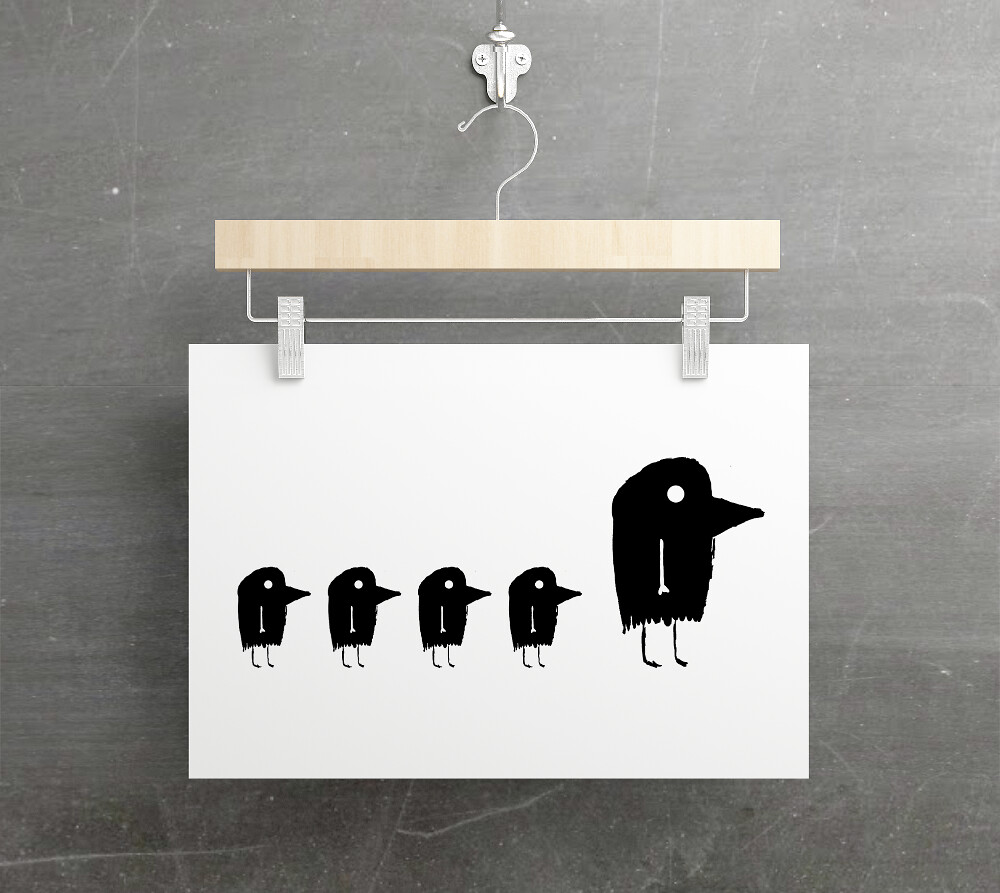
The moody dark Threadless image.
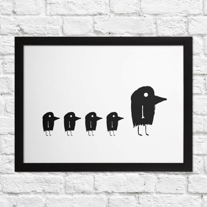
The light and airy Etsy frame image.
If you can spare me a moment of your time, let me know in comments.
Cheers!
Etsy Store: etsy.com/uk/shop/LittleFears
Threadless Store: littlefears.threadless.com/
Edited to add: To clarify, I am only selling the art print, not a frame or coat hanger. (Thanks, Marge!)

The moody dark one, that just captures my attention immediately. yeah It’s not your mainstream type of framed up image… making it much more unique.
LikeLike
24 – 24, back to a draw haha. Thanks, Alexi! 🙂
LikeLike
Your welcome
LikeLike
That’s seriously apples and zebras to me. I really like them both. Is there a way You can use one for a marked period of time, then swap it out for a period of time?
LikeLike
I can swip and swap. I’m leaning towards dark at the moment though heh.
LikeLike
It’s definitely cool. The great thing about this decision is that no matter what You do, it’ll be rockin’ and stylish!!!
LikeLike
Moody dark threadless image. 🙂
LikeLike
24 – 25, Moody takes the lead! Cheers, Dragon!
LikeLike
I like the Light and airy Etsy Frame Image. It looks cleaner! ☺♥
LikeLike
Back to a flat draw, 25 – 25. Cheers Phil!:)
LikeLike
I like the light and airy easy frame image because it looks like a work on an actual wall which is generally the idea when displaying an artwork. When paper is hung from pegs or clips it can curl so this would put me off hanging it that way. Hope this helps.
LikeLike
26 – 25 airy. Thanks for the feedback Artist!
LikeLike
Though on a usual page/presentation I would say the first one would speak more about the whole spirit of your art-world, I would say the airy-etsy is a better eye-catcher as a front page. I would love that on my wall.
LikeLike
Thanks Kate, feedbacks appreciated. 🙂
LikeLike
I liked how the Threadless image was a little different from the usual way to present art, but I liked the Etsy image because it gave me an idea of how the art would look framed. I’d say the Etsy image!
LikeLike
Cheers, K, feedback appreciated. 🙂
LikeLike
2nd one
LikeLike
Thank you, Tilly. 🙂
LikeLike
Love both, but the humor of the first, partially framed by its hanger, grabs the eye: a wardrobe of art! 🙂
LikeLike
Heh, a wardrobe of art. Good idea! 😛
LikeLike